Blinkist
Discovery Re-imagined
Design Strategy | Research | UI | Prototyping

Role: Principal Product Designer
Overview
This case study explores the evolution of the discovery experience in the Blinkist app. The aim was to introduce new paradigms that would prevent users from feeling overwhelmed by the vast library and make discovery enjoyable and efficient.
My Role
I initiated a collaboration with the product manager and cross-functional team to define clear goals and establish metrics for measuring the project's success. I conducted research to assess the strengths and gaps in existing discovery paradigms and partnered with a researcher to develop and test new concepts. Additionally, I worked with data scientists to refine recommendation algorithms and integrate AI-driven suggestions. I also designed the final UI and collaborated closely with the team to implement it.

Data-Informed Approach
I relied on the following data sources to ensure the solutions were data-driven:
Qualitative studies (user testing reports from related projects, Diary Studies)
Quantitative studies conducted by our research team (US market research, Product-Market Fit study, Dormant and Churned Users study)
Analytics (Amplitude studies, data scientist analyses of discovery patterns)
Competitor analyses
User feedback from various sources (App Store/Google Play reviews, customer support feedback)
Design & Research Tools
Figma: Design documentation, UI, prototyping
Miro & FigJam: Workshops
Dovetail: Research documentation
UserZoom & Zoom: User testing
Typeform: Surveys
EyeQuant: Research and validation
Challenges
Key challenges included:
Lack of success metrics: Internally, there was no clear framework for measuring the success of discovery-related projects, making it difficult to assess progress and impact.
Overwhelming discovery experience: The For You screen, designed for content discovery, presented users with too many options. Due to the large volume of content, users felt lost and often left the screen without engaging. Many carousels with content cards had click-through rates below 10%, which might indicate a lack of relevance for many users.
Ineffective browsing paradigm: The content cards gave users insufficient information to make informed decisions. Users frequently clicked on titles only to return to the main screen, suggesting they weren’t receiving enough details upfront.
Unclear recommendation sources: Users were often unsure where the recommended titles came from, making them question the relevance of the suggestions.
Inefficient content card design: Although small in size, content cards displayed repetitive information, resulting in inefficient use of space, which impacted the user’s ability to quickly assess a title.
Limited content variety: Sections on the For You screen relied heavily on past activity and preferences, failing to cater to users' interest in exploring new topics.
“It’s sometimes hard to decide what to choose. I would like an option to declutter my recommendations.”
“I am not sure why some content is recommended to me.”
“I would like to discover content outside my interests and be surprised.”
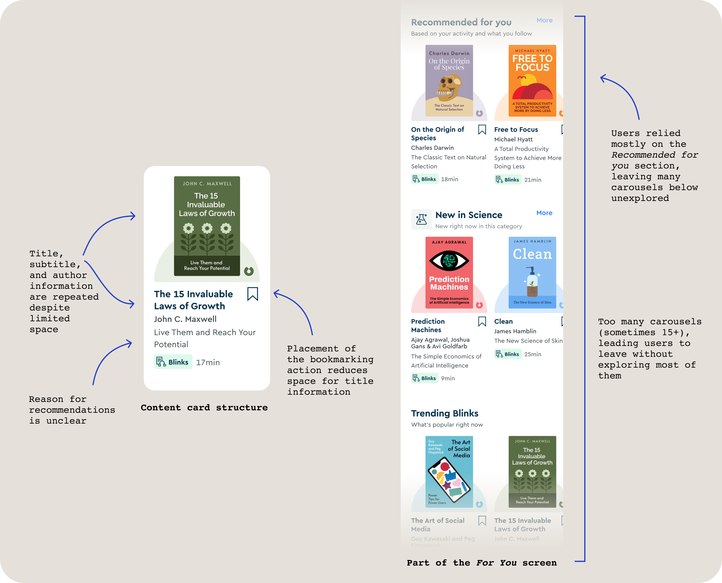
Common issues and key elements of the discovery UI
Path to Solution
The project began with the need for a clear definition of discovery in our product and new metrics to measure its impact. After working with the discovery team’s project manager, we held a workshop to redefine what discovery means, its connection to other app experiences, and how to measure it. We established new success metrics, like the Discovery Rate, which shows how many users started or bookmarked titles for later. We also decided to keep the current engagement metrics to track how many users return to the app and continue learning.

A glimpse into the work on the new definition of discovery
With the new metrics in place, I began exploring the problem area to better understand the strengths and weaknesses of our discovery experience. I reviewed multiple studies conducted by the research team, along with my previous design work and user analytics related to discovery. Additionally, I reached out to other teams, such as content and CRM, to gather insights from their discovery-related projects. I extracted key findings and summarised them as discovery barriers and motivations, which I shared with the team and product leadership to guide our solution development.

Themes from a number of discovery related design projects, research studies and analytics
While exploring new discovery paradigms, I simultaneously worked on defining the app's new Information Architecture. This included drafting initial ideas for the For You screen, which, although not final, offered a solid starting point for my explorations.

Wireframe of the Home screen from the Information Architecture project
I started developing the concept of a discovery feed (offering one recommendation at a time) as an alternative method for content browsing, placing it on the first tab of the For You screen. On the second tab, I explored various inspiring entry points for discovery, including goal-based discovery, daily curated content, themed days, and access to collections and trending content. These elements were designed to broaden users' horizons and extend beyond their stated interests. In the end, I tested two solutions in collaboration with a researcher. I also initiated a partnership with the team responsible for content consumption to evaluate how the new discovery experience worked holistically alongside new consumption ideas.
One of the tested prototypes

User testing study reports
In both studies, the feed concept (versus content carousels) showed strong potential as an alternative way of browsing content. Other discovery entry points, such as goal-based or daily themes, still required further exploration. At this stage, implementing and testing the discovery feed had more supporting evidence as the better paradigm.
Final solution

Feed and content card design
We decided to conduct an A/B test of the new feed in the app, which outperformed the previous paradigm, particularly among new users. Implementation involved significant collaboration with data scientists to develop new recommendation algorithms that integrated insights from the best-performing sections of the old For You screen while also expanding users’ horizons by offering titles from categories they had not yet explored. With the new algorithms, the reasons for recommendations were also more clearly articulated. The new paradigm allowed for concise title descriptions that provided more information, particularly for vague or uninformative titles, and aimed to address the user directly, using AI to create a more personal and motivational tone. The updated card design emphasised the information users considered most useful when making decisions, such as cover art, descriptions, and duration, while avoiding redundancy from the previous pattern. I also established a scalable card system to ensure that it supports all content formats in the app.
Outcomes
The new discovery paradigm increased the Discovery Rate by 6% and significantly improved daily engagement metrics, particularly among new users, contributing to higher trial-to-subscription conversion rates. The scalable design created a more enjoyable and efficient content browsing experience, offering room for future evolution. The feed could now be explored to accommodate diverse content types, such as excerpts, audio, or video-driven recommendations. Additionally, future iterations may include providing more valuable information for users, like ratings or special indicators such as "NYT Bestseller," further improving the discovery experience.