Blinkist
Rebuilding the Architecture
Design Strategy | IA | Research | Prototyping

Role: Principal Product Designer
Overview
This case study explores efforts to identify and resolve issues in Blinkist's Information Architecture (IA), streamline features, and build a scalable structure to support the app's future growth.
My Role
Our product director organised an off-site with the design and research teams to develop initial concepts for the app's new IA. Following that, I took over leadership of the project, reassessed the original concept, and identified ways to improve its clarity and effectiveness. I worked closely with a researcher and aligned regularly with other designers and product leadership. I then shared the final result (a scalable IA framework) with cross-functional teams, guiding them on the next steps for implementation. The project's success was thanks to the strong collaboration and dedication of everyone involved.

Data-Informed Approach
To ensure that the problems and solutions were data-driven, I used the following data sources:
Qualitative studies (user testing, card sorting)
Analytics (Amplitude studies focused on traffic distribution across all primary screens)
Competitor analyses and UX patterns
Quantitative studies conducted by our research team (Product-Market Fit study, Personas study)
Design & Research Tools
Figma: Design documentation, IA charts, wireframing, prototyping
Miro & FigJam: Workshops
Dovetail: Research documentation
UserZoom & Zoom: User testing
OptimalSort: Card sorting
Challenges
We faced several challenges. The key ones were:
Overloaded app areas: Years of heavy testing and introducing new concepts had left parts of the app busy and convoluted. The Information Architecture needed to be reviewed and simplified.
Overwhelming discovery experience: The home screen (For You), driven by recommendations, left users feeling overwhelmed and unsure about the reasons for recommendations.
Complexity in saving content: Multiple saving options (Spaces, Collections, Favourites) made it difficult for users to decide how to save and manage their content.
Unclear screen roles: The differences between For You and Explore, as well as between Spaces and Library, were vague, leading to user confusion about their distinct purposes and overlapping options.
Lack of personal space: There was no dedicated personal space where users could track their learning progress, view their connections, or edit their information, limiting the ability to provide a more personalised user experience.
Lack of space for updates: There was no dedicated area to highlight new content and features without overshadowing existing content.
“...having both the Spaces and the Collections features separately seems like a lot.”
“This screen [Home] feels very busy to me. I don’t know what to do first.”
“I’m not sure what Spaces refers to.”
Path to Solution
We needed to test and refine the initial IA concept. After coming up with an alternative IA solution, I partnered with a researcher to conduct card sorting studies to compare both approaches.
The study showed which groupings worked well and revealed gaps, especially in distinguishing the roles and features of the Spaces and Library screens, which managed saved content and connections. In response, I developed several solutions and tested them with users, ultimately identifying the most suitable option. I then worked with the cross-functional team responsible for this app area to implement the solution, resulting in the merging of Spaces and Library.
At the same time, I explored new discovery paradigms, which further influenced the final IA design.
I consolidated all the findings into updated IA charts, outlining a vision for the main screens. I shared this framework with product leadership and teams, giving them room to explore further as they worked on specific app areas.
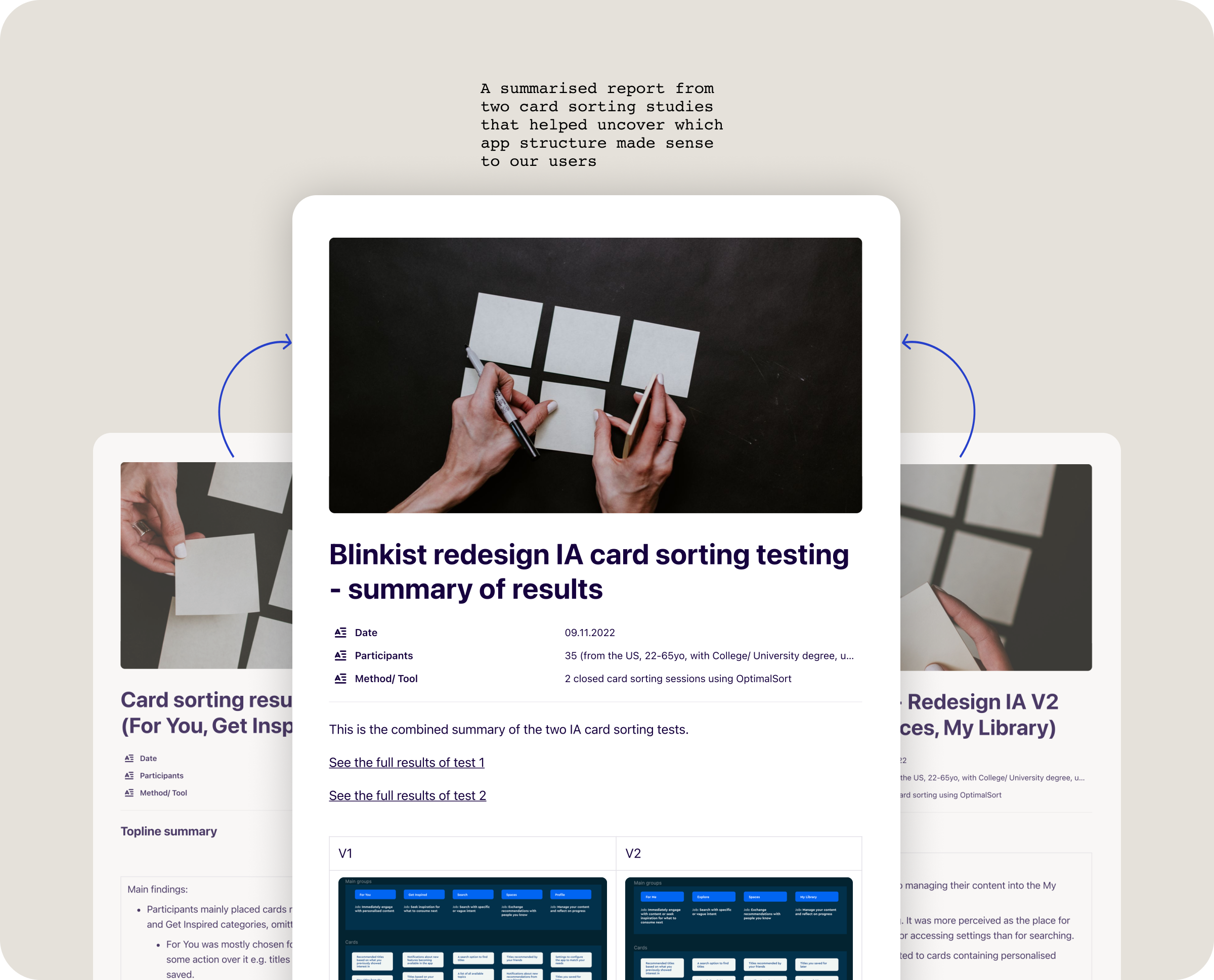
Card sorting study reports

Glimpse into work on merging Library with Spaces screens and simplifying content saving features
Final Solution
The final solution was presented as a clear IA chart and wireframes outlining the vision for three primary screens: Home, Search, and My Library. Each screen had a distinct purpose:
Home: Designed to engage users with content immediately or inspire them with suggestions for what to consume later. (The Home screen was later used to explore new personalised discovery paradigms.)
Search: Enabled users to search with specific or vague intent while exploring the catalogue through simple, well-organised categories.
My Library: Focused on saving, curating, and consuming content, both for personal use and sharing with others.
A key aspect of the solution was merging Spaces and Library into a single, streamlined screen for managing and sharing saved content. This consolidation also retired overlapping features like Collections and Favourites, simplifying content organisation. A Notification Centre was introduced to keep news and updates separate from regular content, ensuring a cleaner user experience. Finally, introducing a My Profile section provided a foundation for future growth beyond practical functions like editing personal details. It was designed with the potential to inform users of their progress and motivate further engagement.

IA chart

Wireframe of the Home screen

Wireframe of the Search and Library screens

Wireframe of the top navigation screens: My Profile and Notification Centre
Outcomes
The new Information Architecture created the way for a more focused approach to app growth, ensuring clarity and scalability. The new IA framework supported future enhancements, such as the new discovery paradigms, Notification Centre, and a dedicated My Profile section. By distributing responsibilities across teams, we fostered collaboration and efficiency in ongoing improvements. User feedback indicated a significant reduction in confusion regarding the Spaces and Library screens, demonstrating that the new design effectively clarified screen roles and simplified the overall experience.