Blinkist
Shortcasts: Podcasts in a Pill
UX Design | Research | UI | Prototyping
Role: Senior Product Designer
Overview
This case study focuses on the introduction of Shortcasts, a new audio format in the Blinkist app. The project aimed to bring key insights from podcasts into the app, complementing the existing non-fiction book summaries.
My Role
I was responsible for the UX and UI design to explore and integrate the new Shortcast format into the Blinkist app. I collaborated with other designers to ensure the format fitted seamlessly within their product areas while working closely with the project manager and the content team to plan and prioritise project phases. Additionally, I conducted design research, both independently and with a researcher, to guide and validate key design decisions throughout the process.
Data-Informed Approach
To ensure this project was backed by data, I relied on the following data sources:
Analytics (Amplitude studies, data scientist analyses)
Qualitative studies (user testing studies)
Competitor & UX Patterns analyses
Quantitative studies (user surveys)
Desk research (Market audio trends)
Design & Research Tools
Figma: Design documentation, UI, prototyping
Miro & FigJam: Workshops
Confluence & Dovetail: Research documentation
UserTesting.com & Zoom: User testing
Challenges
Key challenges included:
Value alignment with user needs: There was uncertainty regarding whether the Shortcasts format and its intended value would resonate with users. We assumed that the new offering would prevent users from missing out on the podcasts they enjoy and provide enough time to listen to them all, but we needed to validate that assumption.
User education: We had to ensure that both new and existing users easily understood what the new format was and the value it offered.
Complex integration and consistency: Integrating Shortcasts into the app without disrupting the existing content discovery experience was essential.
Testing before commitment: The team needed a method to assess the appeal of Shortcasts without making a significant upfront investment.
Design exploration: A thorough exploration of the Shortcasts structure and user interface was essential to ensure alignment with the app’s existing architecture and visual guidelines.
Cross-functional collaboration: The successful development and promotion of Shortcasts required strong collaboration among the content, product, and marketing teams.
“I wouldn’t like to miss out on the good podcasts that match my interests.”
“I don’t have enough time to listen to all of the podcasts I like.”
Path to Solution
To begin the process, the content team produced a few pilot episodes, allowing the research team to gather initial feedback on the first impressions and the overall quality of the content. Simultaneously, I explored how to integrate the Shortcasts space into the app. I started by creating user flows for new and existing users, outlining key hypotheses and metrics to evaluate them.
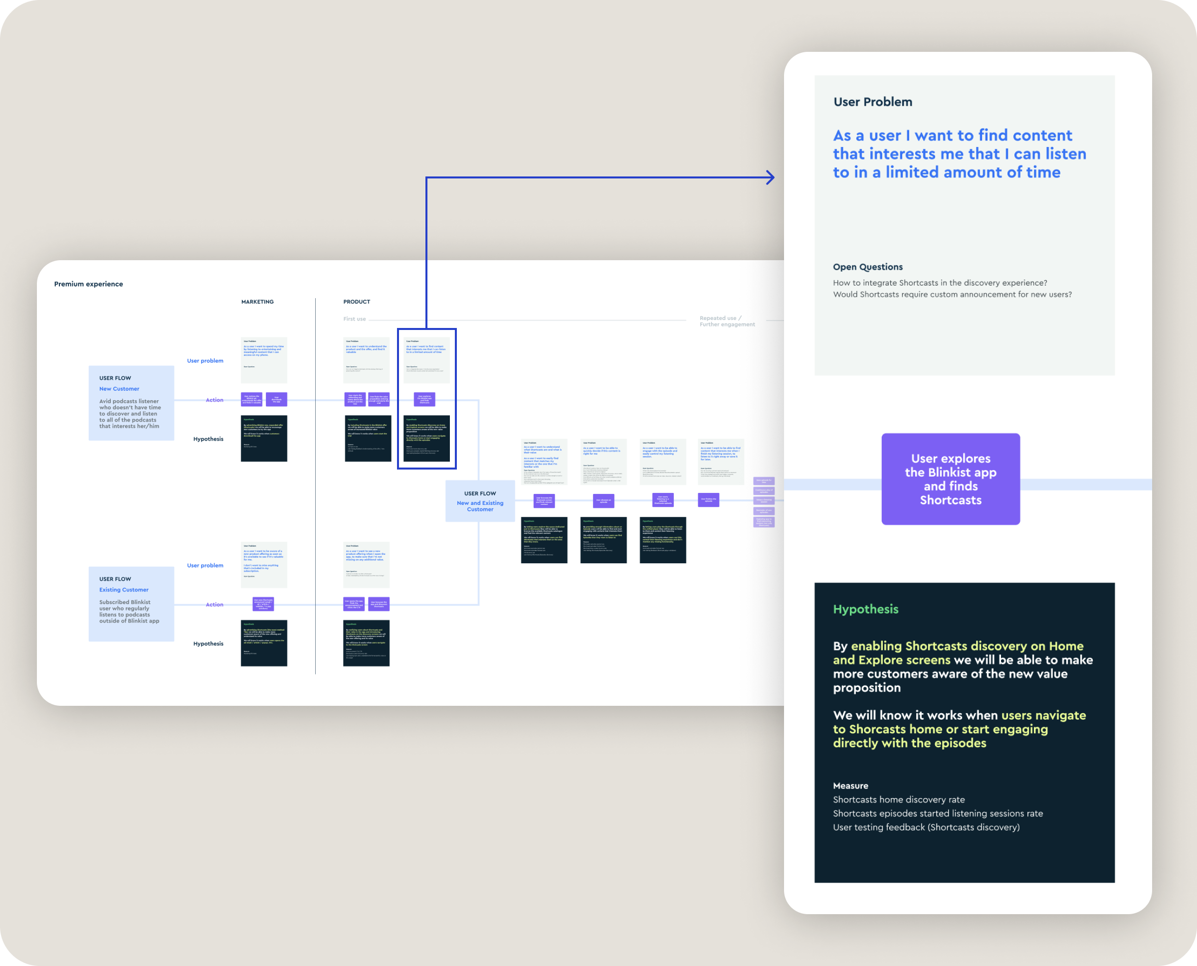
User flows explored for both new and existing users
With these flows in place, I conducted a thorough competitor analysis and researched UX patterns specific to podcast apps. My goal was to establish a familiar structure for users accustomed to podcasts while ensuring seamless integration with our other content types. Throughout this exploration, I collaborated closely with designers from other app areas to ensure alignment across teams.
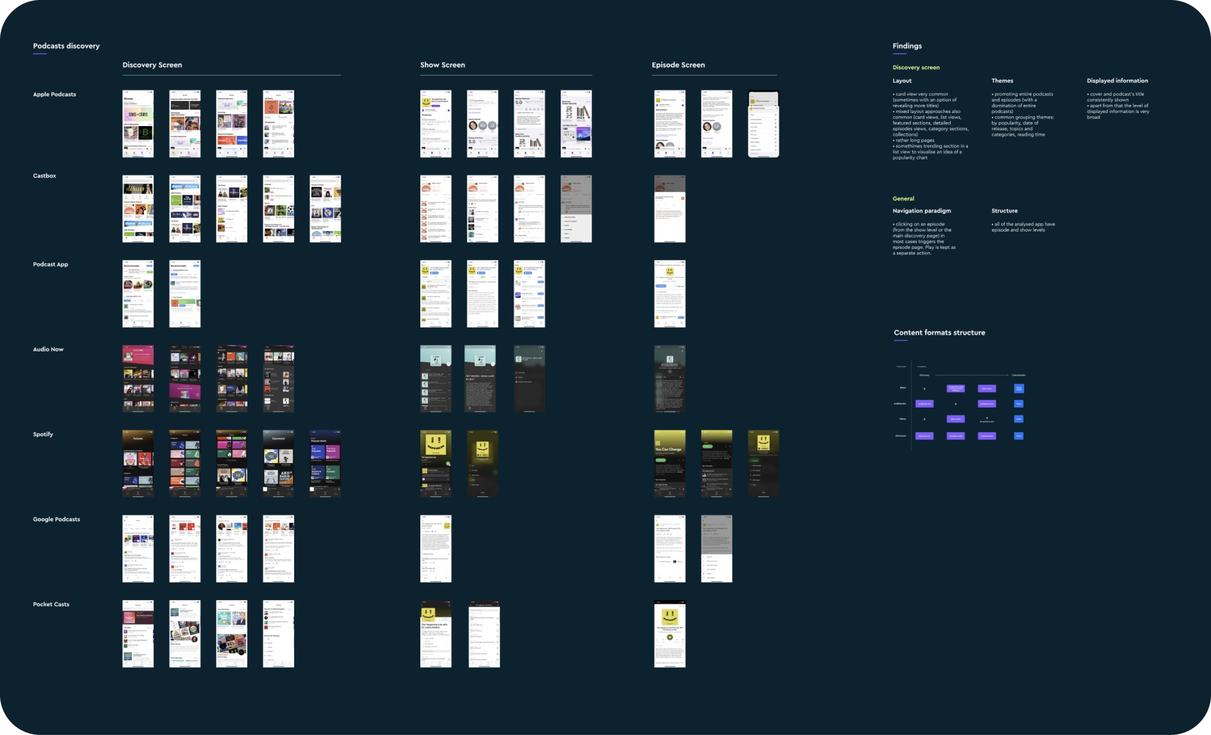
Exploration and analysis of podcast app structures and UX patterns
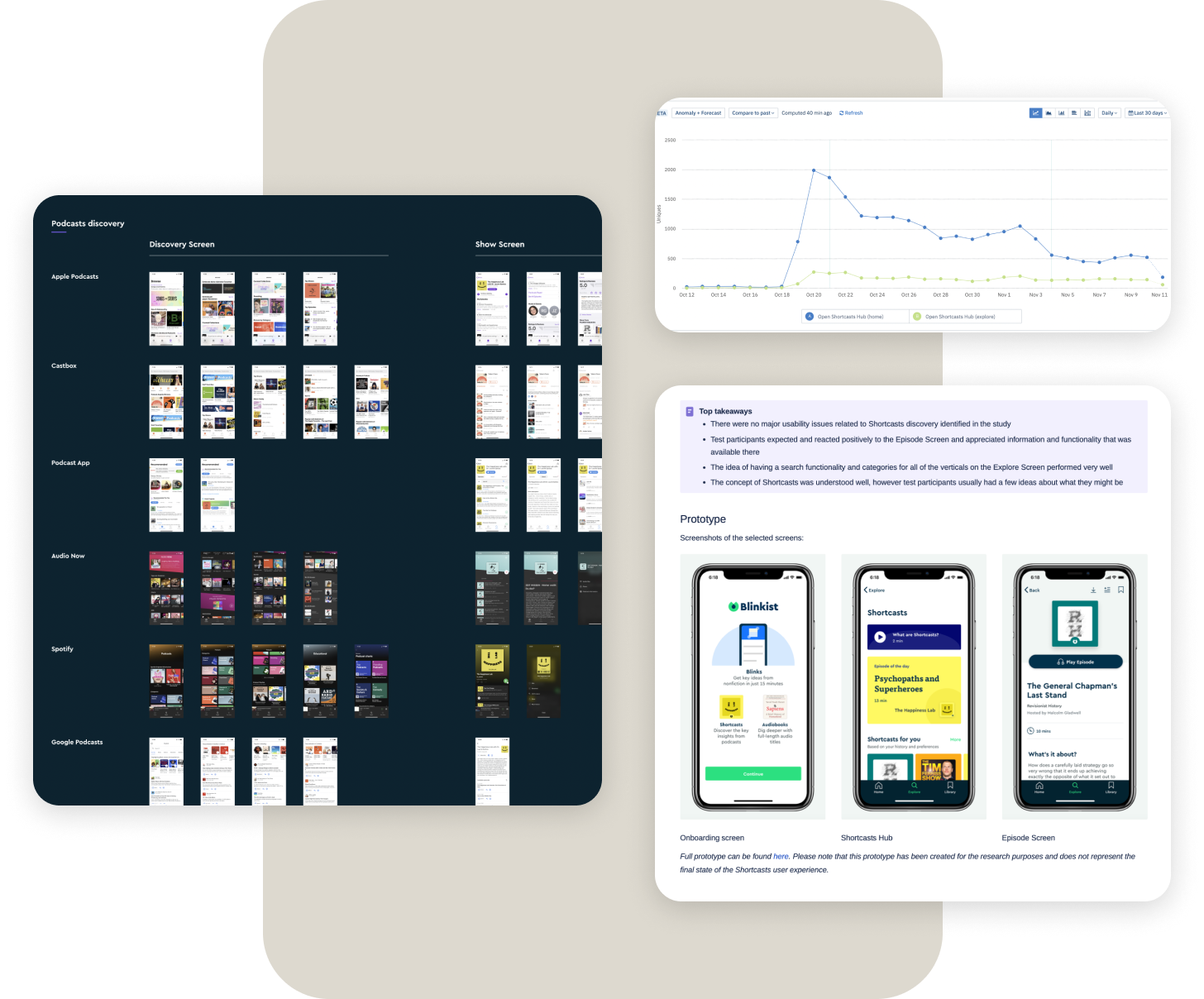
After a few working sessions with my cross-functional team and rounds of feedback, I created the first set of wireframes. I then developed these into prototypes and tested them with users. The initial testing gave me useful feedback, allowing me to improve the concept and test it again, leading to a more refined solution.
An example of a wireframed flow for new users
One of the tested prototypes
Final solution
The user tests provided encouraging results: the design solutions were validated, and users expressed interest in the new format. Based on this feedback, we decided to proceed with a beta test involving 1,000 users, followed by an A/B test within the app. I created the final UI designs for Shortcasts, which enabled these tests and supported the launch of the new format in the app.
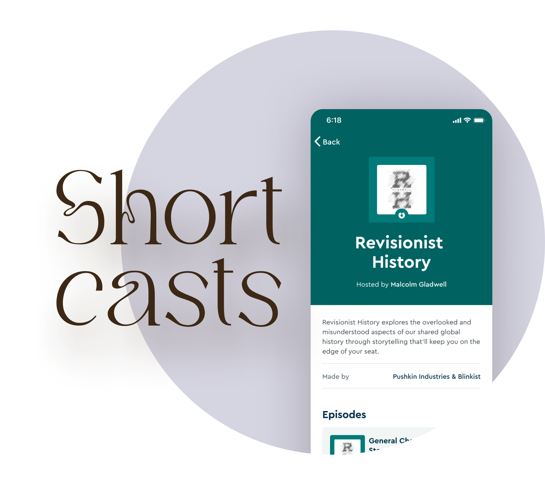
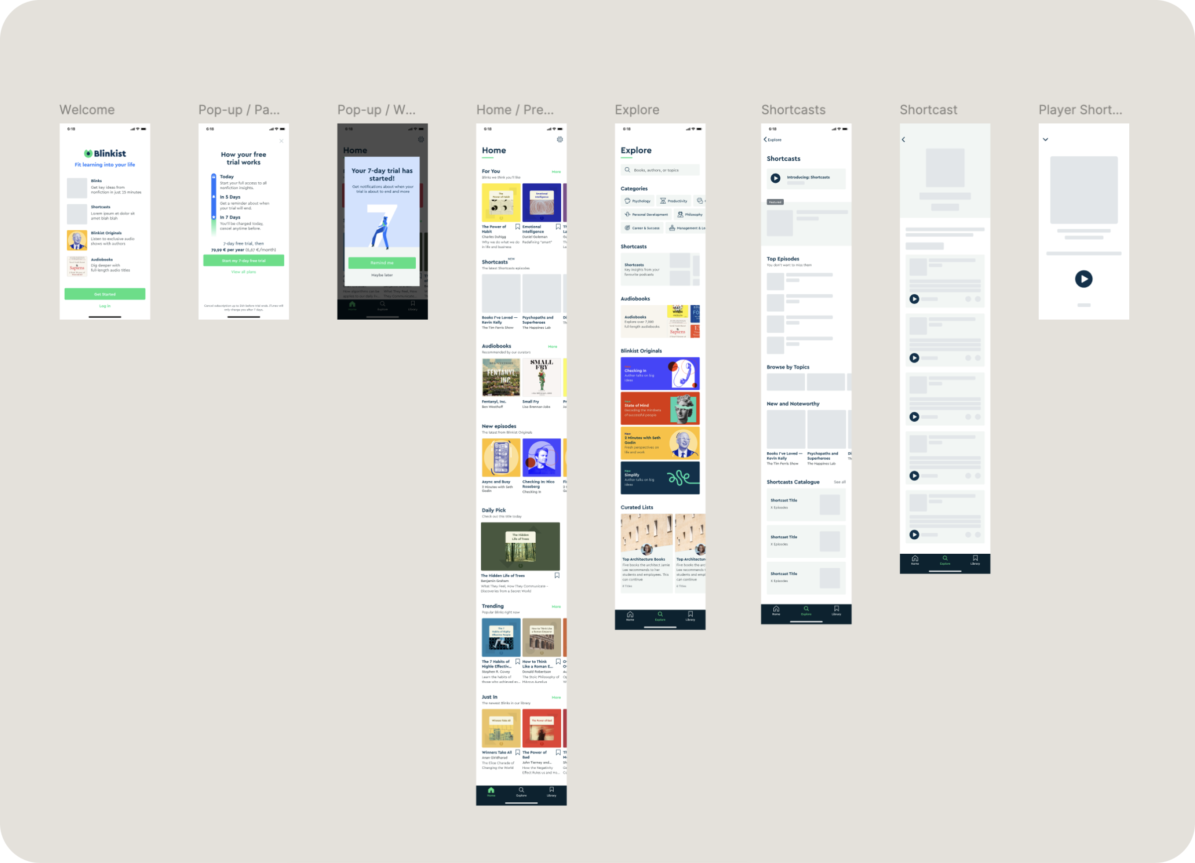
The new Shortcast format was successfully integrated across multiple discovery points in the app, including home carousels, search, content categories, and a Shortcasts section in the catalogue. The final design also introduced a focused way to browse Shortcasts through a dedicated hub featuring daily curation, recommended sections, and Shortcast categories, along with an entry point to the full catalogue.
Although the Shortcast structure mirrored familiar podcast app patterns, it remained consistent with the content formats already available in the app. The listening experience for Shortcasts was designed to offer full feature parity with other formats, as well as smooth navigation between episodes.

Shortcasts discovery screen designs

Shortcasts show, episodes and player screens
Outcomes
The integration of the new Shortcasts format into the app was largely successful, with survey data showing that 61% of respondents were aware of its availability following the full launch. While this indicated broad exposure, it also highlighted opportunities for improved promotion. Among users who listened to at least one episode, 76% expressed interest in continuing their Shortcasts journey, demonstrating strong engagement with the content. These results highlight that while the format already resonated with users, there is great potential to further increase visibility and embed Shortcasts even more deeply within the product. This marked the promising beginning of the Shortcasts journey, unlocking new possibilities for future enhancements, deeper integration, and laying the foundation for seamlessly introducing and testing new content formats within the app.