Blinkist
Evolution of the Audio Experience
UX Design | Research | UI | Prototyping

Role: Senior Product Designer
Overview
This is a selection of projects I led in 2020-21 aimed at improving the quality and setting a new competitive standard for audio experiences in the Blinkist app.
My Role
As the only designer in a cross-functional team, I led and executed all design aspects: initial research, team ideation, UI design, prototyping, design QA, and user testing.
By closely collaborating with project managers, I influenced the direction and priorities of the audio initiatives. I also involved other product designers to refine the solutions and initiated and collaborated on various research studies conducted by our research team.

Data-Informed Approach
To ensure that the problems and solutions were data-driven, I used the following data sources for the projects listed below:
User feedback from various sources (App Store/Google Play reviews, customer support feedback, Product-Market Fit study, customer surveys)
Analytics (Amplitude studies, data scientist analyses)
Competitor analyses
Qualitative studies (user testing studies)
UX expert reviews (following usability heuristics)
I developed a data-based framework for each project that guided the team in addressing challenges.
Design & Research Tools
Figma: Design documentation, UI, prototyping
Miro & FigJam: Workshops
Dovetail: Research documentation
UserTesting.com & Zoom: User testing
Typeform: Surveys
PROJECTS
Unbreaking the Queue Experience
Challenges
Blinkist users were facing difficulties in maintaining a seamless listening experience. They struggled with planning their listening sessions and found building an audio queue cumbersome. The available queue sources were limited to the titles in their library, ignoring broader contextual recommendations, such as starting a title from a curated section on the home screen. This disrupted the flow and flexibility of the listening experience.
“I want to know where are my titles played from.”
“I don’t know what will be played next.”
“I’d like to plan my listening session ahead.”

Common issues when listening to multiple titles
Path to Solution
We needed a new queue model to improve how listening sessions were structured. I led the exploration of various technical and design options, developing three potential models. I then created prototypes for each, focusing on layout and user interface to ensure a polished and user-friendly experience. Finally, I conducted user testing to identify the most effective model.

One of the tested queue models
One of the tested prototypes
Final solution
The chosen solution performed best in user testing. It introduced a new, easier-to-find queue entry point and made several usability improvements, such as autoplay control, clear labelling of manually added titles versus recommended ones, snackbars confirming user actions, and design enhancements like cover images and consistent track styling. Additionally, it improved track management by ensuring the queue respects the starting point of the audio session (e.g., if a user starts listening to a collection, the queue will continue with tracks from it instead of jumping to the user's library).
Outcomes
The new queue model, combined with the more accessible design, significantly boosted user engagement. The new solution led to increased consumption rates in a single session: 16.4% of users finished three titles in one session, compared to 7.8% previously.
Mini-player and New Navigation Paradigm
Challenges
Users frequently reported difficulties in controlling their listening experience while browsing the app. This issue was rooted in a more significant problem with the app's navigation paradigm. While the mini-player bar allowed users to control playback, it was attached to the navigation bar, which was only visible on primary screens. The navigation bar would disappear whenever users accessed secondary screens, as these were presented as overlays.
Although our primary goal was to enhance the audio experience, we first needed to address the larger issue with the app's navigation system.
“I want to be able to listen to audio and browse the app simultaneously.”
“I don’t know how to turn off audio when I leave the playback screen.”
Path to Solution
We needed a new navigation paradigm that would allow users to move between different areas of the app with minimal steps. By attaching the mini-player to the main navigation bar, which would remain visible throughout the app while browsing, we could simultaneously resolve our audio issues.
To achieve this, I analysed the current user flows and crafted a proposal for the new solution. I also researched various navigation paradigms used in popular content apps and initiated several working sessions with developers to explore technical possibilities for improving the navigation system.
Additionally, I conducted user testing sessions to confirm that the new navigation paradigm and mini-player functioned effectively.
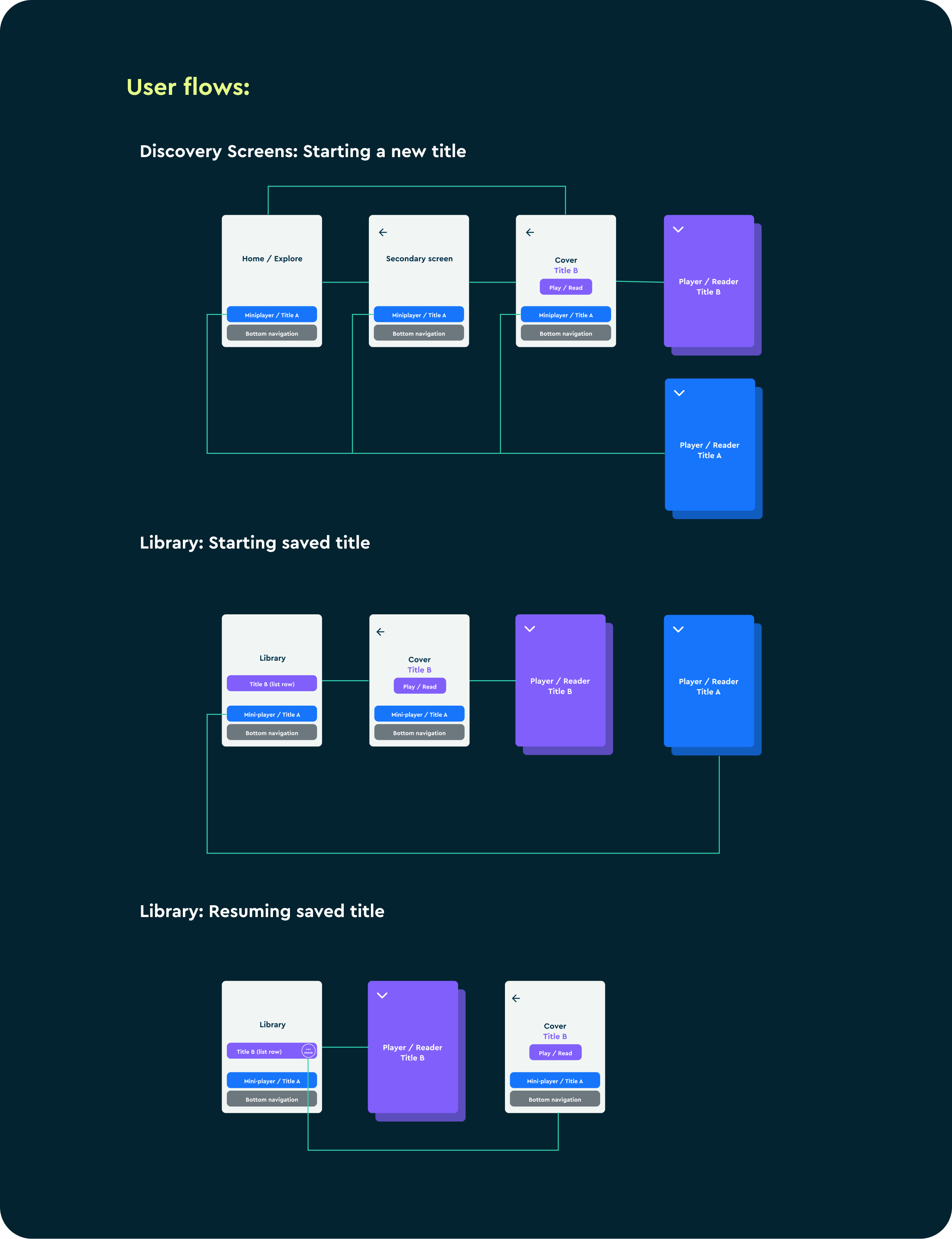
Examples of the new navigation paradigm flows with the mini-player.
Final Solution
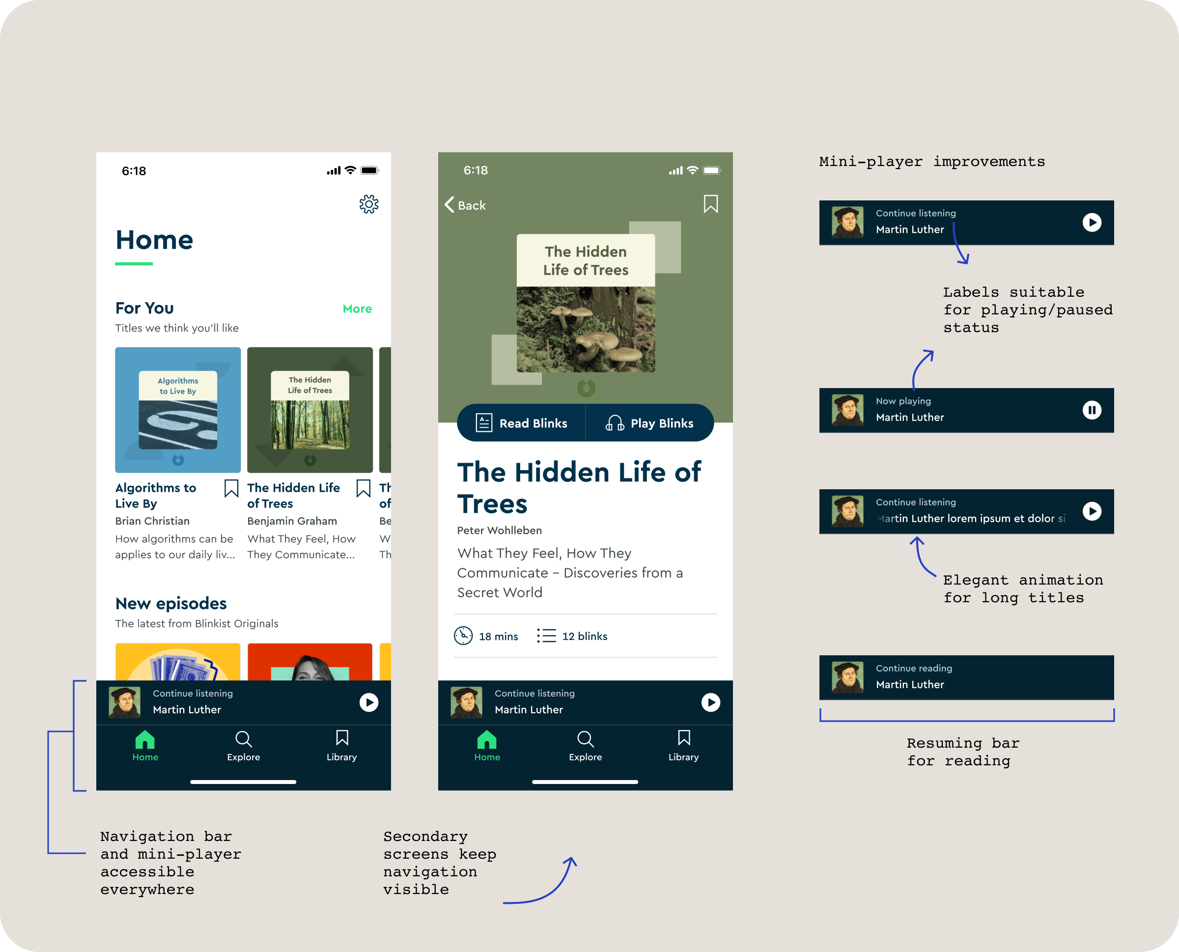
User testing revealed that the new navigation paradigm significantly outperformed the old one. Users also quickly grasped and appreciated the enhancements to the mini-player. The updated navigation ensured that both primary and secondary screens had a visible navigation bar, with the player screen being the only exception as it opened as an overlay without navigation. This new approach made it possible and enjoyable for users to listen and browse simultaneously.
Outcomes
The introduction of the new navigation paradigm resulted in a significant drop in customer complaints regarding the ability to listen while browsing. Additionally, there was a substantial reduction in issues related to app navigation overall. The new navigation system was easier to maintain and provided a clear framework for future product expansion, ensuring consistency and ease of use as the app evolves.
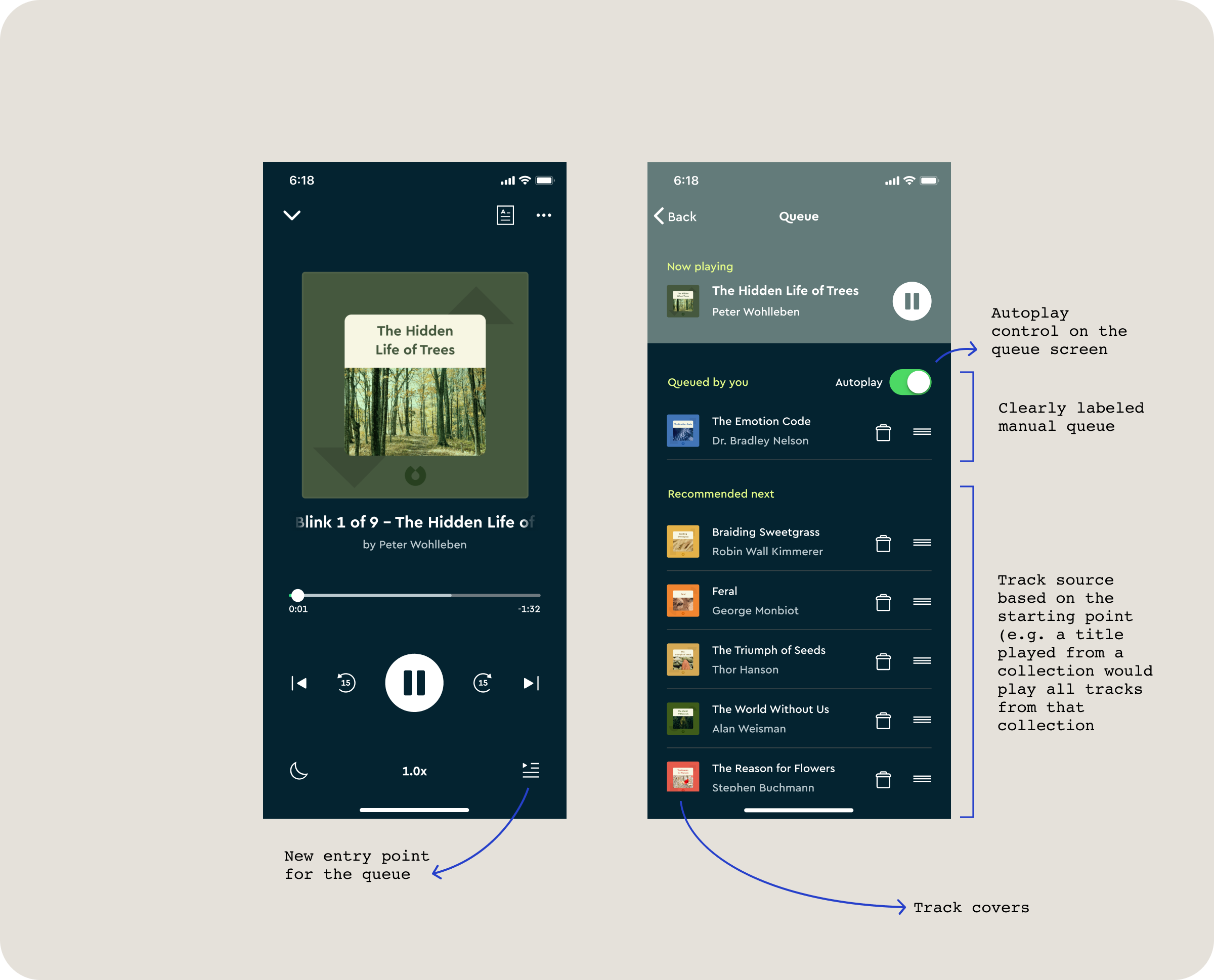
Queue Experience: Fine Tuning
Challenges
Despite observing a stable boost in engagement metrics, we continued to receive user complaints about the queue's functionality. Users often struggled to locate the queue, which made it harder for them to understand the source of the tracks and what would be played next. They also found it challenging to control whether the next track should play automatically and reported bugs when moving tracks within the queue.
“Why is it so hard to find my queued list?”
“I don’t like how the app will immediately play another book once I have just finished one.”
Path to Solution
To address user complaints, I first analysed Amplitude data to assess their impact. The data revealed that only 7% of users engaged with the queue, where information about track sources and autoplay controls was available. With this insight, I facilitated brainstorming sessions with the team to generate and refine potential improvement ideas. Following this, I developed and tested two prototypes with users. Based on the results, we chose to implement the prototype that performed best.
Final Solution
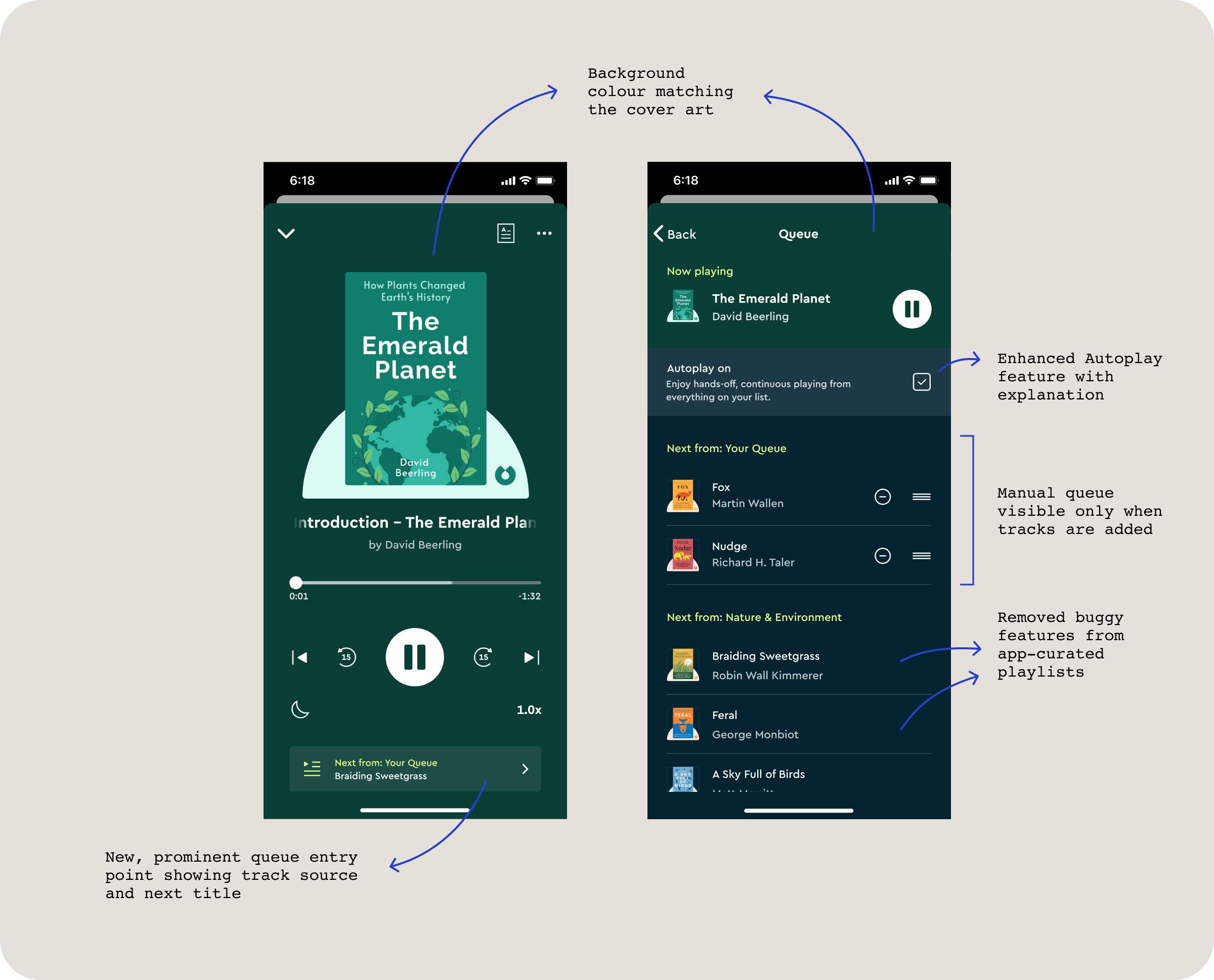
The final solution introduced several key usability improvements: a prominent queue entry point displaying information about the track source and the next title to play, an explanation of the autoplay feature on the queue screen, and queue management features restricted to user-built queues to prevent bugs. The manual queue section, which was used by only a few users, was made hidden unless tracks were added. Both queues now clearly indicate the sources of tracks. Additionally, we incorporated design enhancements such as the player colour adapting to the cover art and smoother transitions between screens.
Outcomes
The new design resulted in fewer issues reported to customer support regarding the queue. Analytics showed an increase in the number of users accessing the queue screen. Additionally, user reviews provided positive feedback on the improvements made to the audio features.
The projects featured in this case study represent only a fraction of my work in audio design. My efforts also included unifying multiple players within the app, continuing to improve the autoplay functionality, and implementing numerous enhancements to the player, to name a few. Collectively, these initiatives have greatly improved the user experience and strengthened our position in the competitive field of premium audio products.